

Text & Typography
Adding a text element
Section titled “Adding a text element”Press T or click the Text tool in the toolbar. A text box appears on the canvas and is selected immediately. Start typing, or edit the content in the Text Content textarea in the Properties panel.
The Typography tab
Section titled “The Typography tab”Select a text element and click the Typography tab in the Properties panel. A text element shows Design and Typography tabs; a third Variable tab appears only once the element is bound to a variable.
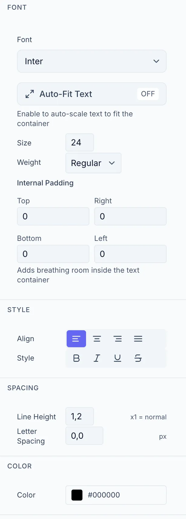
Choose from 47 curated Google Fonts in the Font dropdown. The font name is rendered in its own typeface for easy identification.
Auto-Fit Text
Section titled “Auto-Fit Text”Auto-Fit automatically scales the font size to fill the text box. This is especially useful when the text is a variable (e.g. {{product_name}}) and the content length is unpredictable.
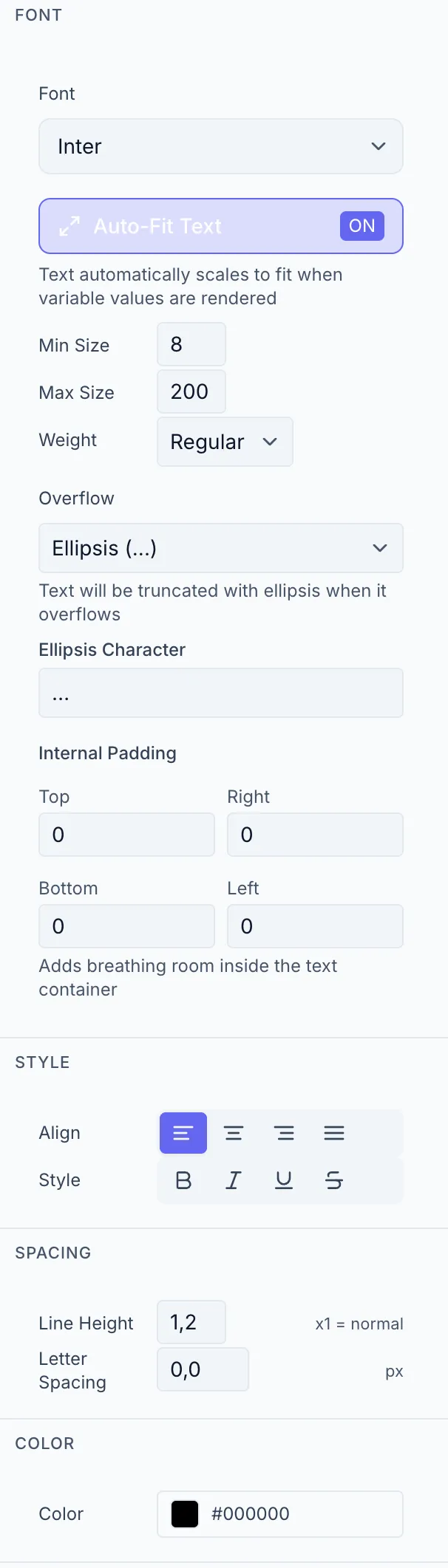
Toggle: The Auto-Fit Text button shows ON / OFF.
When ON, the following fields become available:
| Field | Description |
|---|---|
| Min Size | Minimum font size in px (the text never shrinks below this) |
| Max Size | Maximum font size in px (the text never grows above this) |
| Weight | Font weight (same as without Auto-Fit) |
| Overflow | What happens if text still doesn’t fit: Visible (allow overflow), Clip (cut off), Ellipsis (…) |
| Ellipsis Character | The character shown for Ellipsis mode (default: …) |
When OFF: Size (px, 8–200) and Weight fields appear directly.
Internal Padding
Section titled “Internal Padding”Four fields (Top, Right, Bottom, Left in px) add space between the text and the edge of the text box. Useful for keeping text from touching the edges of a colored background shape.
| Control | Options |
|---|---|
| Align | Left / Center / Right / Justify |
| Style | Bold, Italic, Underline, Strikethrough (multi-select) |
Spacing
Section titled “Spacing”| Control | Description |
|---|---|
| Line Height | Multiplier (0.5–3, default 1 = normal line height) |
| Letter Spacing | Extra spacing between characters in px (−10 to 50) |
A color picker sets the text fill color.
Editing text content
Section titled “Editing text content”For non-variable text, a Text Content textarea appears above the Font section. Type or paste your text there. Changes are reflected on the canvas immediately.
For variable-bound text the area shows “Linked to {{variableName}}” and the variable tab is where you set the default value. See Variable Settings.