

Shapes
Zandovi includes nine shape types. All shapes share common properties (fill, stroke, opacity, shadow, position, size, rotation) covered in Appearance, Color & Gradients and Arrange, Align & Layer Order. This page covers the shape-specific controls.
Rectangle
Section titled “Rectangle”Add with key R. The most common shape.
Shape-specific property: Corner Radius (px) — rounds the corners. Use a large value (e.g. half the height) to create a pill shape.
Circle
Section titled “Circle”Add with key O. A perfect circle. Resize it proportionally by dragging a corner handle while holding Shift. If you resize it non-uniformly (different width and height), it is automatically converted into an Ellipse element — so a squashed circle becomes a true ellipse rather than a distorted circle.
Ellipse
Section titled “Ellipse”Add with key E. An oval with independent horizontal and vertical radii, so it can be as round or as stretched as you like.
There are no shape-specific controls: an ellipse uses only the common Appearance, Shadow, and Transform properties. Drag any handle to reshape it — corner handles change both radii, edge handles change one.
Triangle
Section titled “Triangle”Add with key G.
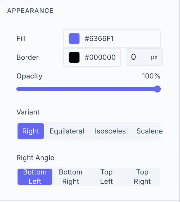
Shape-specific properties:
| Control | Options |
|---|---|
| Variant | Equilateral, Isosceles, Right, Scalene |
| Right Angle | Position of the right angle (visible only when Variant = Right) |
Add with key L. A straight line segment.
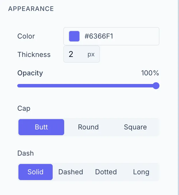
Shape-specific properties:
| Control | Options |
|---|---|
| Color | Stroke color |
| Thickness | Stroke width in px (1–50) |
| Cap | Butt / Round / Square |
| Dash | Solid / Dashed / Dotted / Long |
Lines also show a Length (read-only, calculated distance) in the Transform section.
Add with key A. A line with one or two arrowheads.
Shape-specific properties: Same as Line, plus:
| Control | Description |
|---|---|
| Head Length | Length of the arrowhead in px (5–60) |
| Head Width | Width of the arrowhead in px (5–60) |
Add with key S. A multi-pointed star.
Polygon
Section titled “Polygon”Add with key P. A regular hexagon (6 sides). The side count is fixed for polygons created in the Designer — there’s currently no control to change the number of sides.
Curved Rectangle
Section titled “Curved Rectangle”Add with key U. A rectangle where one side bows inward or outward.
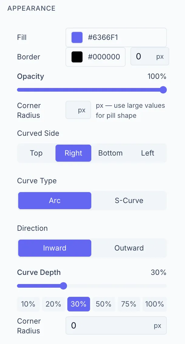
Shape-specific properties:
| Control | Options |
|---|---|
| Curved Side | Top / Bottom / Left / Right |
| Curve Type | Arc / S-Curve |
| Direction | In / Out |
| Curve Depth | 0–100% — quick preset buttons available |
| Corner Radius | Rounds the non-curved corners |