

Interface Tour
The Designer is divided into six regions. This page gives you the map; each region has its own deep-dive page.
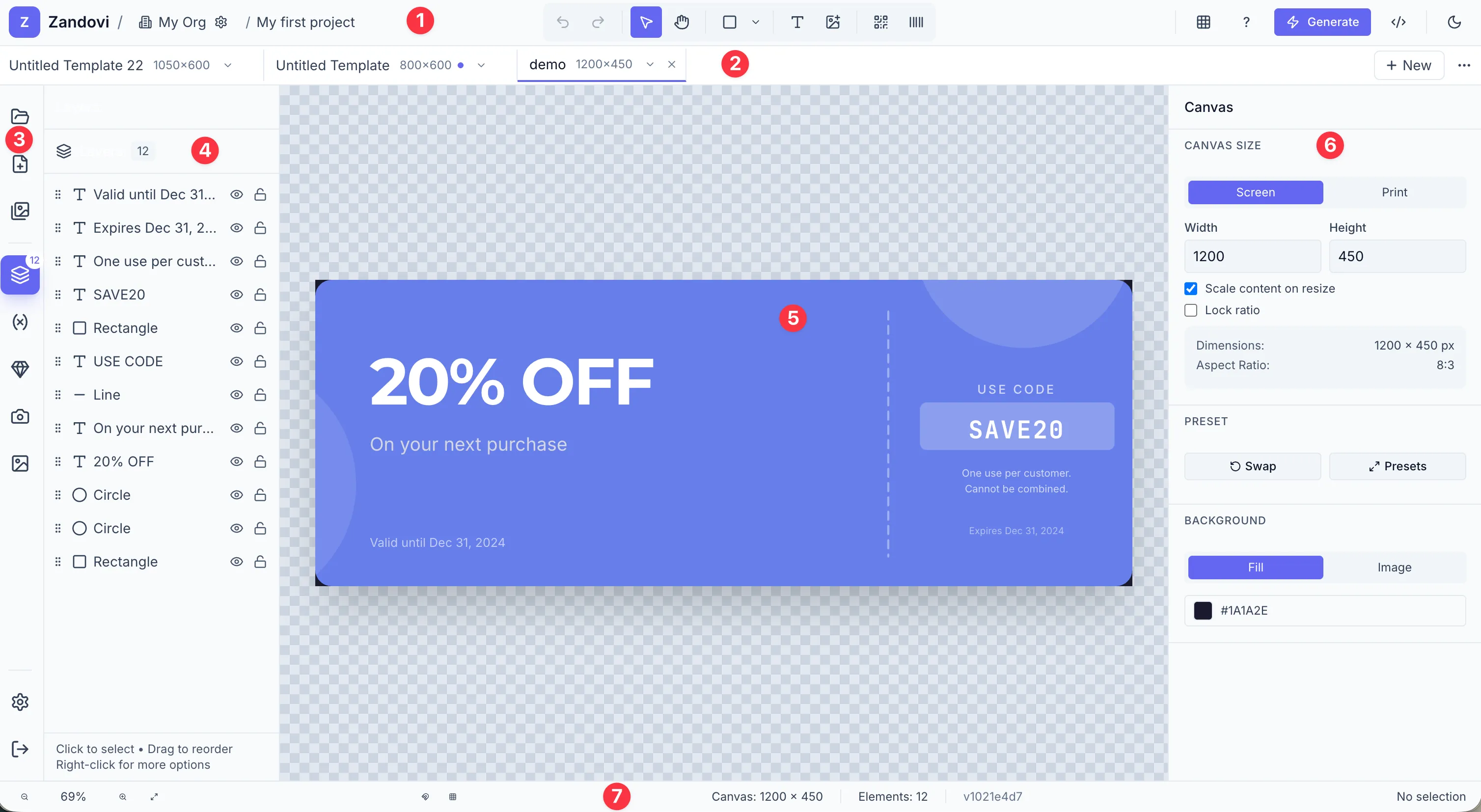
1 — Header
Section titled “1 — Header”The top bar contains (left to right):
- Brand + Workspace Switcher — click to switch workspaces.
- Project name breadcrumb — double-click to rename the current project.
- Tool palette — Undo/Redo, Select, Hand, shapes dropdown, Text, Image Variable, QR Code, Barcode, View options.
- Right actions — Keyboard shortcuts, Use this template, Generate button, API example, Save status, Theme toggle, Plan/Upgrade.
See Adding & Selecting Elements and Setting Up the Canvas.
2 — Template tab bar
Section titled “2 — Template tab bar”A scrollable row of tabs, one per template in the project. The + button adds a new canvas. Tabs show a dirty indicator (orange dot) when there are unsaved changes. See Working with Multiple Templates.
3 — Left sidebar rail
Section titled “3 — Left sidebar rail”A narrow icon rail of actions and panel triggers (48 px wide):
| Icon | Tooltip | Action |
|---|---|---|
| Folder | Open Project | Opens the Project Picker |
| File+ | New Canvas | Opens the New Canvas dialog |
| Images | Project Templates | Opens the Template Gallery |
| Layers | Layers | Opens the Layers panel |
| Variable | Variables | Opens the Variables panel |
| Gem | Icons | Opens the Icons panel |
| Camera | Stock Images | Opens the Stock Images panel |
| Image | My Images | Opens your uploaded-images library |
| Settings | Settings | Navigates to /settings |
| Log out | Sign out | Signs you out |
4 — Left panel
Section titled “4 — Left panel”Clicking a panel button in the rail opens a 240 px panel alongside it. Each panel is documented in its own page:
- Layers — Layers Panel
- Variables — Variable Settings
- Icons — Icons
- Stock Images — Images
- My Images — Images
5 — Canvas area
Section titled “5 — Canvas area”The main design surface. Shows the canvas at its configured dimensions, with optional rulers, grid, and smart guides. See Navigating the Canvas.
6 — Properties panel
Section titled “6 — Properties panel”A 320 px panel on the right edge. Its content adapts to your current selection:
- Nothing selected → Canvas settings (size, background).
- Single element → Design / Typography / Variable tabs.
- Multiple elements → Alignment and grouping controls.
- Group → Group properties.
See The Properties Panel.
7 — Footer
Section titled “7 — Footer”The 32 px bar at the bottom provides:
- Zoom controls (− percentage +, Fit to Screen button).
- Snapping toggles (Smart Guides magnet, Snap to Grid grid icon).
- Canvas info (width × height in px).
- Element count.
- Selection status (nothing selected / element type + position / N elements selected).
- Build version (far right).